Creating Infographics: Visualizing Data for Better Understanding
Understanding the Importance of Infographics
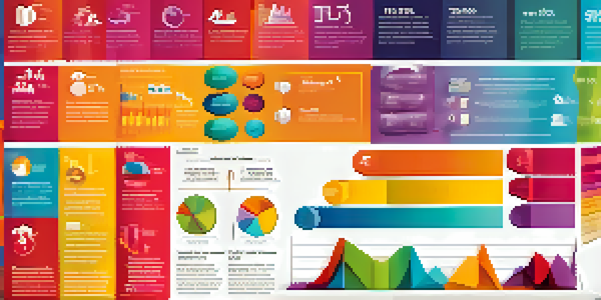
In today’s fast-paced digital world, infographics play a crucial role in data presentation. They transform complex information into easily digestible visuals, making it simpler for audiences to grasp key points quickly. By combining graphics with text, infographics can enhance understanding and retention of critical data.
Data is the new oil.
Imagine trying to explain a complicated set of statistics without any visuals. It would be like navigating a maze blindfolded! Infographics guide viewers through the data, illuminating trends and insights that might otherwise remain obscured. They serve as a visual storytelling tool that captures attention and communicates messages effectively.
Moreover, our brains are wired to process images faster than text. This means that a well-designed infographic can significantly improve the way information is perceived. By using visuals strategically, you can not only convey data but also evoke emotions, making your message resonate more with your audience.
Identifying Your Audience and Purpose
Before diving into the design process, it's essential to understand who your audience is and what message you want to convey. Are you targeting professionals in a specific industry, or are you aiming for a broader public audience? Identifying your audience helps tailor the content and design to meet their needs and expectations.

Equally important is defining the purpose of your infographic. Are you aiming to inform, persuade, or entertain? For instance, an infographic meant to educate about health statistics will differ significantly from one intended to promote a product. Knowing your purpose will guide the tone and style of your visuals.
Infographics Simplify Complex Data
By transforming intricate information into engaging visuals, infographics enhance understanding and retention.
By aligning your audience and purpose, you create a strong foundation for your infographic. This clarity will help you choose the right data, design elements, and storytelling techniques, ensuring your final product is both engaging and relevant.
Gathering and Analyzing Your Data
The backbone of any effective infographic is solid data. Start by gathering relevant statistics and facts from credible sources. This not only strengthens your message but also builds trust with your audience. Think of data as the ingredients for a recipe; without quality ingredients, the final dish won’t taste good.
A picture is worth a thousand words.
Once you have your data, take the time to analyze it for patterns, trends, and insights. This step is crucial because it helps you determine the most compelling aspects to highlight in your infographic. For example, if you're creating an infographic about climate change, pinpointing the most alarming statistics can make your message more impactful.
Remember, the goal is to simplify the data without losing its essence. Look for ways to present the information that are both visually appealing and easy to understand. This might involve breaking complex data sets into smaller, more digestible chunks.
Choosing the Right Design Style
The design style of your infographic can greatly influence its effectiveness. It’s essential to choose a style that aligns with your message and audience. For example, a corporate report might benefit from a clean, professional design, while a social media infographic could be more playful and colorful.
Consider using elements like colors, fonts, and icons to reinforce your message. Colors can evoke emotions, while fonts can convey tone. For instance, bright colors can grab attention, while muted tones may project seriousness. Selecting the right design elements is like dressing your message for the occasion.
Know Your Audience and Purpose
Identifying your target audience and the purpose of your infographic is crucial for tailoring content and design.
Don’t forget about layout! A well-structured infographic flows smoothly, guiding the viewer's eye through the data. Using a grid system can help maintain balance and organization, ensuring that the most important information stands out.
Crafting Compelling Content and Headlines
Strong content is key to any successful infographic. When crafting your text, aim for clarity and brevity. Use concise language that conveys your points without overwhelming the viewer. Think of your infographic as a conversation; you want to engage your audience without losing them in a sea of words.
Headlines are particularly important—they're the first thing viewers see, and they set the tone for what follows. A catchy headline can draw people in, while a dull one might cause them to scroll past. Consider using action words or questions to pique interest and encourage further exploration of your content.
Additionally, remember to include data sources in your infographic. This not only gives credit where it's due but also enhances credibility. Just like you wouldn’t share a rumor without verifying it, your audience will appreciate knowing the origin of your data.
Utilizing Tools for Infographic Creation
In today’s digital landscape, there are numerous tools available to help you create stunning infographics without needing extensive design skills. Platforms like Canva, Piktochart, and Visme offer user-friendly interfaces with templates that can streamline your design process. Think of these tools as your trusty sidekicks in the infographic creation adventure!
These tools often come with pre-designed elements, making it easy to incorporate charts, icons, and illustrations that enhance your message. You can customize colors and fonts to align with your brand, ensuring consistency across your visuals. This is especially important if you’re creating multiple infographics over time.
Evaluate Success for Improvement
Assessing metrics and gathering audience feedback after sharing your infographic helps refine future designs.
While these tools simplify the design process, don’t forget the importance of your unique touch. Personalizing your infographic with distinctive elements can help it stand out in a crowded digital space. After all, a little creativity goes a long way in making your message memorable.
Sharing and Promoting Your Infographic
Once your infographic is complete, it’s time to share it with the world! Use social media platforms, blogs, and email newsletters to get your infographic in front of your target audience. Platforms like Pinterest and Instagram are particularly effective for visual content, allowing you to reach a broader audience.
Consider reaching out to influencers or industry leaders who might share your infographic. This can amplify your message and extend your reach significantly. Think of it as a digital ripple effect—one share can lead to many more, increasing visibility and engagement.

Additionally, don’t forget to optimize your infographic for search engines. Use relevant keywords in your title, description, and alt text to improve discoverability. This way, your infographic doesn’t just sit on a page; it actively attracts viewers who are searching for information related to your topic.
Evaluating the Success of Your Infographic
After sharing your infographic, it’s essential to evaluate its success. Look at metrics such as views, shares, and engagement rates to gauge its impact. This data can provide valuable insights into what worked well and what could be improved for future projects.
You might also consider soliciting feedback from your audience. Engaging with viewers not only shows you care about their opinions but can also help you refine your approach. For example, if some viewers found certain sections unclear, that’s a great cue to focus on simplifying those areas next time.
Ultimately, evaluating your infographic's success is about continuous improvement. Each project offers lessons that can enhance your future designs, ensuring that your visual storytelling becomes increasingly effective over time. Remember, creating infographics is a journey, and every step brings you closer to mastering the art of visual communication.