Data Visualization Techniques in Learning Analytics Reporting
Understanding the Importance of Data Visualization
Data visualization serves as a bridge between raw data and meaningful insights, especially in educational contexts. With vast amounts of information generated by learning analytics, visual representation helps to simplify complex datasets. This transformation allows educators and stakeholders to quickly grasp trends and patterns that might otherwise go unnoticed.
Data is the new oil, but like oil, data has to be refined to be valuable.
For instance, a simple graph can highlight student performance trends over time, making it easier to identify which teaching methods are effective. By presenting data visually, we cater to diverse learning styles—some individuals might grasp concepts better through visuals than through lengthy reports. This accessibility is crucial in creating an inclusive learning environment.
Moreover, effective data visualization can spark conversations around data-driven decision-making. When educators see clear visual representations of student engagement and academic success, they're more likely to implement strategies that enhance learning outcomes. In the realm of learning analytics, the clarity provided by visualization directly impacts the quality of educational experiences.
Choosing the Right Visualization Tools
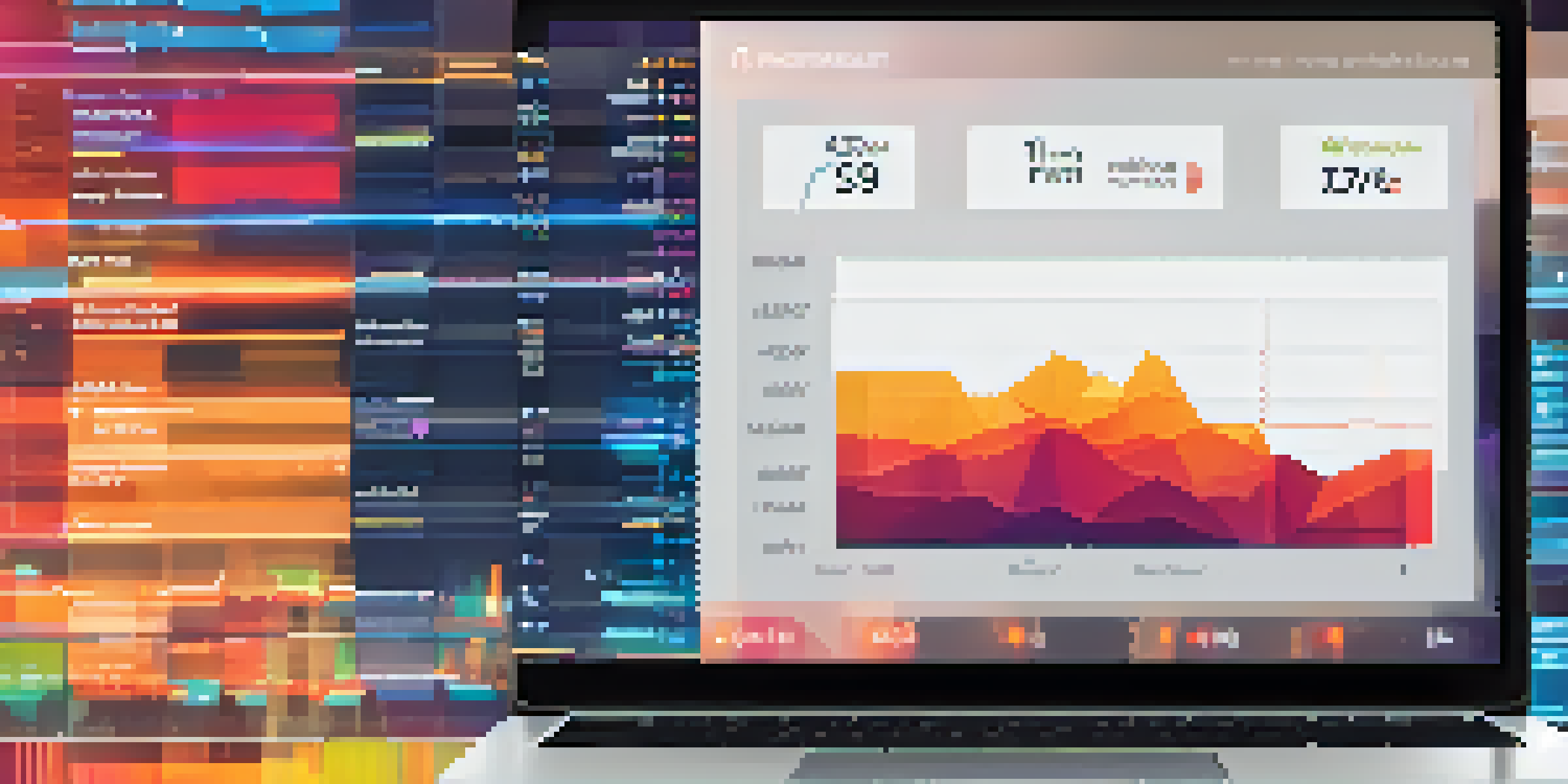
Selecting the appropriate tools for data visualization is essential to convey the right message. Popular options include Tableau, Google Data Studio, and Microsoft Power BI, each offering unique capabilities tailored for educational data. The choice of tool often depends on the specific requirements of the analysis being conducted and the audience it is intended for.

For example, if you're looking to create interactive dashboards for real-time data monitoring, Tableau might be your best bet. On the other hand, Google Data Studio is user-friendly and allows for seamless integration with other Google services, which is perfect for educators already using Google Classroom. Understanding these tools can significantly enhance the effectiveness of your learning analytics reporting.
Data Visualization Simplifies Insights
Visual representations of data help educators quickly identify trends and enhance understanding across diverse learning styles.
Ultimately, the goal is to choose tools that not only fit your technical needs but also resonate with your audience. By aligning your visualization tool with the preferences and skills of your users, you can ensure that your data is presented in a way that is both engaging and informative. This alignment fosters a deeper understanding of the data and its implications for student learning.
Types of Visualizations for Learning Analytics
Various types of visualizations can effectively communicate insights from learning analytics. Common examples include bar charts, line graphs, heat maps, and scatter plots. Each type serves a distinct purpose; for instance, line graphs are excellent for showing trends over time, while heat maps can illustrate areas of high engagement in a course.
The goal is to turn data into information, and information into insight.
Consider a scenario where an educator uses a heat map to visualize student participation across different modules. This visual can quickly highlight which topics are engaging students and which ones require more focus. By employing the correct visualization type, educators can present data in a way that is both intuitive and impactful.
Additionally, it’s crucial to consider the story your data tells when selecting visualizations. Combining different types of visuals can create a more comprehensive narrative, helping stakeholders understand not only what the data shows but why it matters. This storytelling aspect is vital in making data actionable, leading to improved educational strategies.
Best Practices for Effective Data Visualization
Implementing best practices in data visualization ensures your reports are both effective and engaging. One fundamental principle is to keep visuals simple and uncluttered, allowing the audience to focus on the key insights without distractions. Using consistent colors and fonts also enhances readability and establishes a visual identity for your reports.
Additionally, incorporating labels and legends is essential for clarity. Viewers should be able to understand what they are looking at without requiring extensive explanations. For instance, a bar chart should clearly indicate what each axis represents, and if color coding is used, a legend should be included to explain it.
Choosing Tools Enhances Communication
Selecting the right data visualization tools tailored to the audience ensures effective communication of insights.
Lastly, always consider your audience when designing visualizations. Tailoring your visuals to their level of expertise and familiarity with the data can make a significant difference in comprehension. Engaging your audience with thoughtful design choices fosters a deeper connection with the data, encouraging them to act on the insights provided.
Interactive Visualizations: Enhancing Engagement
Interactive visualizations take data engagement to the next level by allowing users to explore the information themselves. Features such as tooltips, filters, and zoom options empower educators and students to delve deeper into the data, making their experience more personalized. This hands-on approach increases interest and retention of the information presented.
For instance, an interactive dashboard might allow users to filter data by specific student demographics, enabling educators to tailor their teaching strategies effectively. This ability to manipulate data not only fosters a deeper understanding but also encourages critical thinking skills as users analyze and draw conclusions based on the information they uncover.
Moreover, interactive visuals can facilitate collaboration among educators and stakeholders. By sharing dashboards or reports that allow for real-time interaction, teams can engage in meaningful discussions about the data, leading to more informed decisions. This collaborative approach enhances the overall educational experience and promotes a culture of data-driven decision-making.
The Role of Color in Data Visualization
Color plays a pivotal role in data visualization, influencing how information is perceived and understood. Using contrasting colors can help distinguish between different data sets, while a cohesive color palette can create a visually appealing report. However, it's vital to use color thoughtfully to avoid overwhelming the audience with too many hues.
For example, a well-chosen color scheme can highlight key trends or anomalies within the data. If a particular student cohort is performing significantly better than others, using a bold color for that data point can draw immediate attention. This strategic use of color not only enhances comprehension but also guides the audience's focus towards important insights.
Interactive Visuals Foster Engagement
Interactive visualizations enable users to explore data actively, promoting a deeper understanding and collaboration.
Furthermore, accessibility should be a priority when choosing colors. Color-blind individuals may struggle to interpret visuals that rely heavily on color differentiation. By considering color accessibility and providing alternative ways to understand the data, such as patterns or shapes, you can ensure that your visualizations are inclusive and effective for all audiences.
Evaluating the Impact of Data Visualizations
Once data visualizations are implemented, evaluating their effectiveness is crucial for continuous improvement. Gathering feedback from users can provide insights into what works well and what may need refinement. This feedback loop is essential for evolving your approach to data visualization in learning analytics.
For instance, surveys or focus groups can reveal how educators interact with the visualizations and whether they find them helpful in decision-making. Analyzing this feedback allows you to make data-driven adjustments to your reports, ensuring they remain relevant and effective over time. It's all about creating a dynamic process that adapts to the needs of users.

Additionally, measuring the outcomes of decisions made based on your visualizations can provide valuable insights into their impact. Did student engagement improve after implementing strategies highlighted in the data? Tracking these metrics can help validate the effectiveness of your visualizations and reinforce a culture of data-driven decision-making within educational institutions.